Exploring Categorical, Time-Series, and Spatial Data Visualizations
This investigation focuses on identifying and analyzing specific examples for each category: categorical, time-series, and spatial data.
Our goal is to scrutinize the intended information, evaluate the effectiveness of the visualizations, and suggest potential improvements.
This exercise underscores the pivotal role of visualization in translating raw data into actionable insights for informed decision-making.
Categorical data, consisting of distinct categories or groups, often benefits from bar charts, pie charts, or histograms to highlight relationships and proportions.
Time-series data, representing information over sequential intervals, is best portrayed through line charts or stacked area charts to visualize trends over time.
Spatial data, involving geographical or spatial relationships, is often represented through maps, heatmaps, and choropleth maps to tie insights to location.
I. Categorical Data Visualization
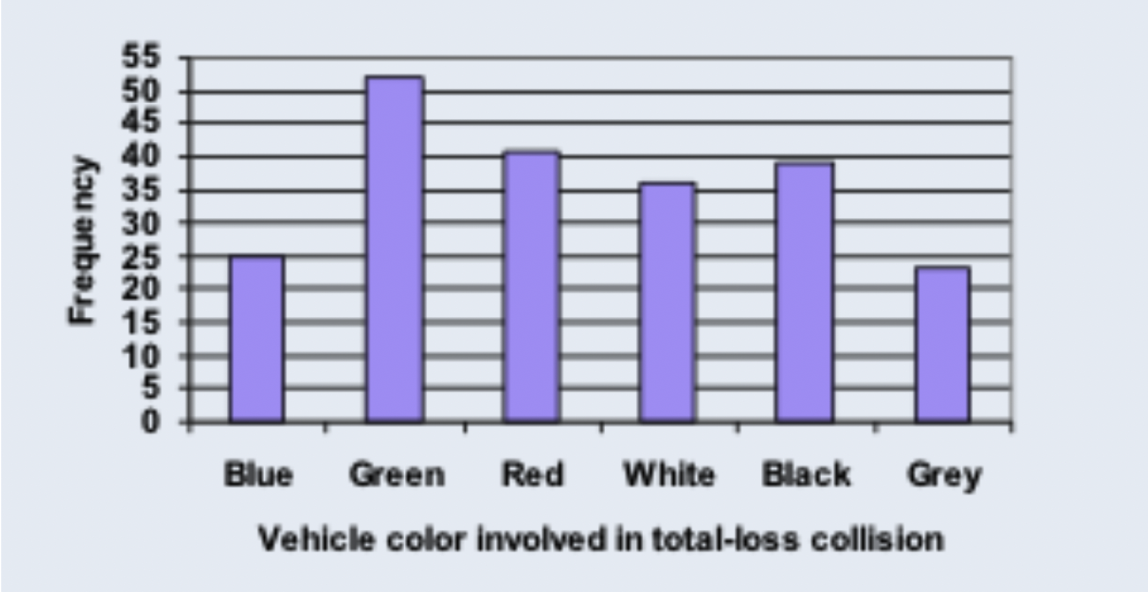
In this categorical data visualization, the x-axis depicts vehicle colors involved in total-loss collisions, while the y-axis represents the frequency of each color in a straightforward bar chart format.
The color spectrum of collisions includes blue, green, red, white, black, and gray, with frequency values ranging from 25 to 52.
This visualization, while not grounded in real-world data, effectively conveys the distribution of collisions by vehicle color.
Its simplicity, featuring a limited palette and manageable data size, contributes to clarity and ease of interpretation.
To enhance the visualization, I recommend using higher-contrast colors against the grayish background.
Despite this, the representation serves its purpose well, offering valuable insights into frequency patterns.
II. Time-Series Data Visualization
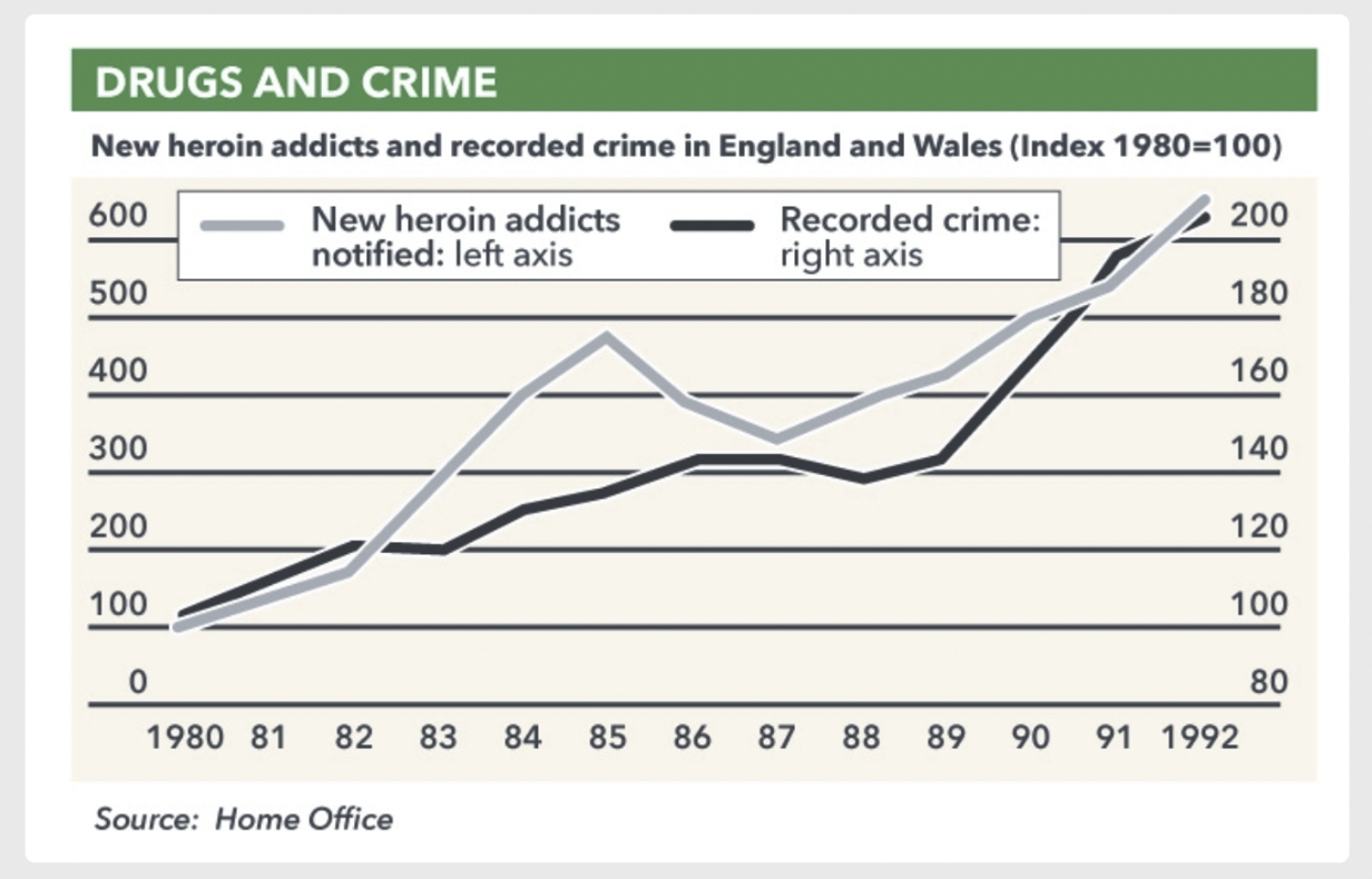
This time-series visualization spans 1980–1992, plotting new heroin addicts and recorded crime in England and Wales.
The left y-axis represents addicts (0–600, 100-unit increments), while the right y-axis represents crime (80–200).
The chart suggests a correlation between drug use and crime trends.
However, differing y-axis increments could exaggerate the relationship, creating ambiguity.
Both lines ascend, but the actual correlation remains unclear.
Improving this visualization would involve aligning axes more transparently and clarifying whether trends are directly related.
III. Spatial Data Visualization
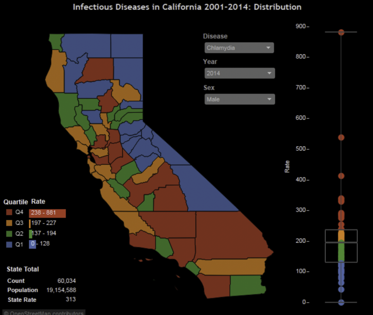
This spatial visualization maps chlamydia cases among males in California (2004), using color-coded quartiles:
- Blue (Q1: 0–128 cases)
- Green (Q2: 137–194 cases)
- Orange (Q3: 197–227 cases)
- Red (Q4: 238–861 cases)
The state’s total population was 19,154,588, with 60,034 reported cases.
This visualization is highly effective, offering a precise breakdown across regions.
Its quartiles are granular enough for easy comparison, making it an excellent tool for public health interpretation.
Little improvement is necessary, as it already balances clarity and detail.
Conclusion
This assignment explored categorical, time-series, and spatial visualizations, each demonstrating distinct strengths and weaknesses:
- Categorical bar charts excel in simplicity and clarity but benefit from color optimization.
- Time-series charts reveal temporal patterns but risk misleading audiences if scales are inconsistent.
- Spatial maps provide highly intuitive regional insights and often require little adjustment.
These examples highlight the versatility of visualization methods in making data accessible and actionable.
Whether simplifying distributions, clarifying trends, or revealing geographic patterns, effective visualizations are essential for informed decision-making.